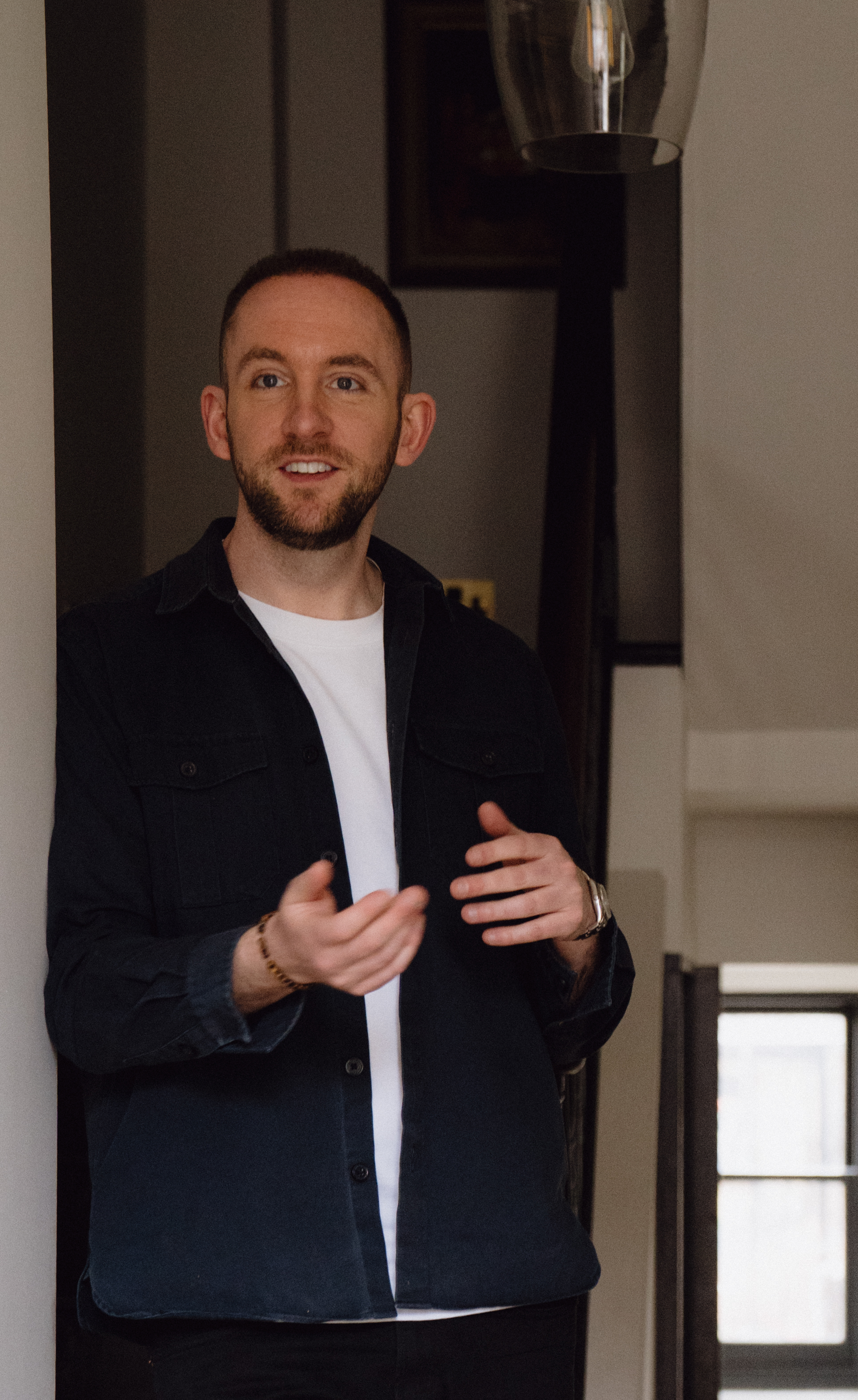
In Conversation With: Rob Abrahams, Co-Founder of COAT
The Brand Changing How We Choose Paint at Home.
From curated colour palettes to conscious production, COAT is reshaping how we choose, use and experience paint in contemporary homes.
In an industry long defined by functionality and familiarity, COAT Paints is quietly redefining what it means to buy paint. Through a more considered, design-led approach, the brand brings together curated colour palettes, sustainable production and a distinctly modern perspective on interior design.
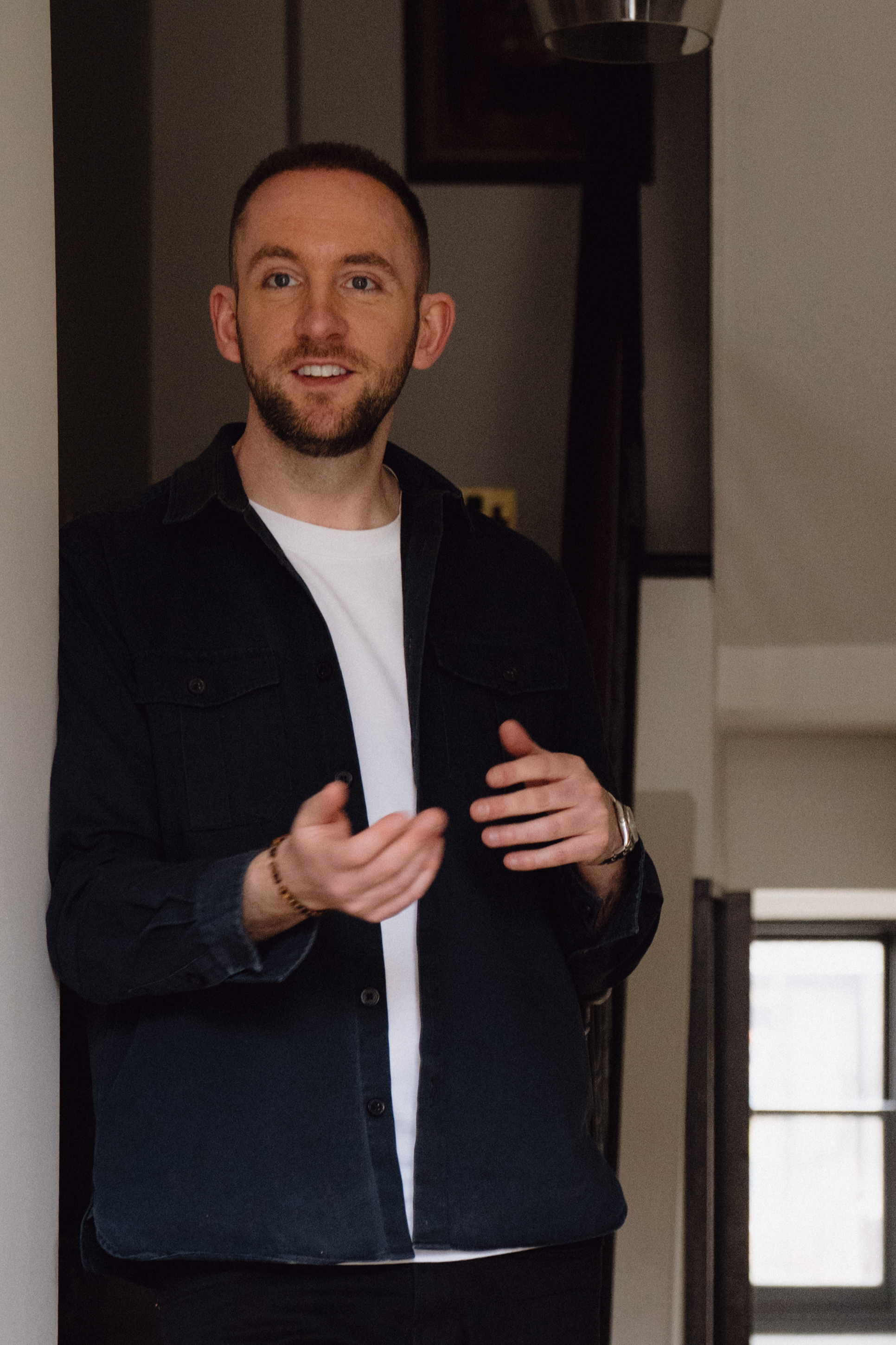
Founded by Rob Abrahams during his own renovation experience, COAT was born from a frustration with a system that felt outdated, wasteful and unnecessarily complex. What followed is a new model for contemporary decorating, one that simplifies colour selection while elevating paint beyond a functional product into a key part of how we experience space.
As colour becomes central to mood, atmosphere and lifestyle, paint is no longer just a finishing detail, but a defining layer of modern interiors. In this conversation, Rob reflects on the evolution of paint as a lifestyle category, the shift towards more intentional colour choices, and how design-led brands are reshaping the way we live at home.
COAT was born out of a desire to rethink how we buy paint. What was the moment you realised the traditional paint model wasn’t working, and how did that insight shape the brand you’ve built today?
The idea for COAT really came from a personal experience. Rob and I were both renovating our homes and found ourselves making repeated trips to DIY stores, buying endless tester pots and still struggling to feel confident about the colours we were choosing. It was time-consuming and when we looked at the pile of half-used testers afterwards, it also felt incredibly wasteful.
That moment made us realise the traditional paint model hadn’t really evolved with how people decorate today. The process was messy, inefficient and not particularly sustainable, and the experience of choosing colour felt overwhelming rather than inspiring.
That insight shaped COAT from the start. We set out to redesign the whole journey, simplifying colour choice with a curated palette, replacing tester pots with peel-and-stick samples, and producing paint to order to reduce waste. The aim was to make buying paint feel modern, intuitive and much more aligned with how people design their homes today.

Paint is often seen as a commodity. How did you approach building COAT as a lifestyle brand rather than simply a decorating product, and what lessons have you learned about branding in a traditionally “offline” category?
From the outset we didn’t want COAT to feel like a traditional paint brand. We saw it as a brand about the home and how people live in it. Paint is obviously the product, but what people are really looking for is inspiration and confidence when it comes to using colour.
That’s why we focused heavily on design, storytelling and a curated palette that helps customers build schemes rather than choose a single colour in isolation. A big part of the brand is helping people overcome “colour paralysis”, where too many options lead people to default to something safe.
The biggest lesson has been that branding can completely transform even very traditional categories. Paint has historically been sold in very functional retail environments, but if you approach it as a lifestyle brand with strong design inspiration and a clear point of view you can engage customers in a completely different way.
We’re seeing a shift away from safe neutrals in some quarters, while others are doubling down on comforting tones. From your perspective, what are the defining paint trends right now, and what do they say about how we want to live?
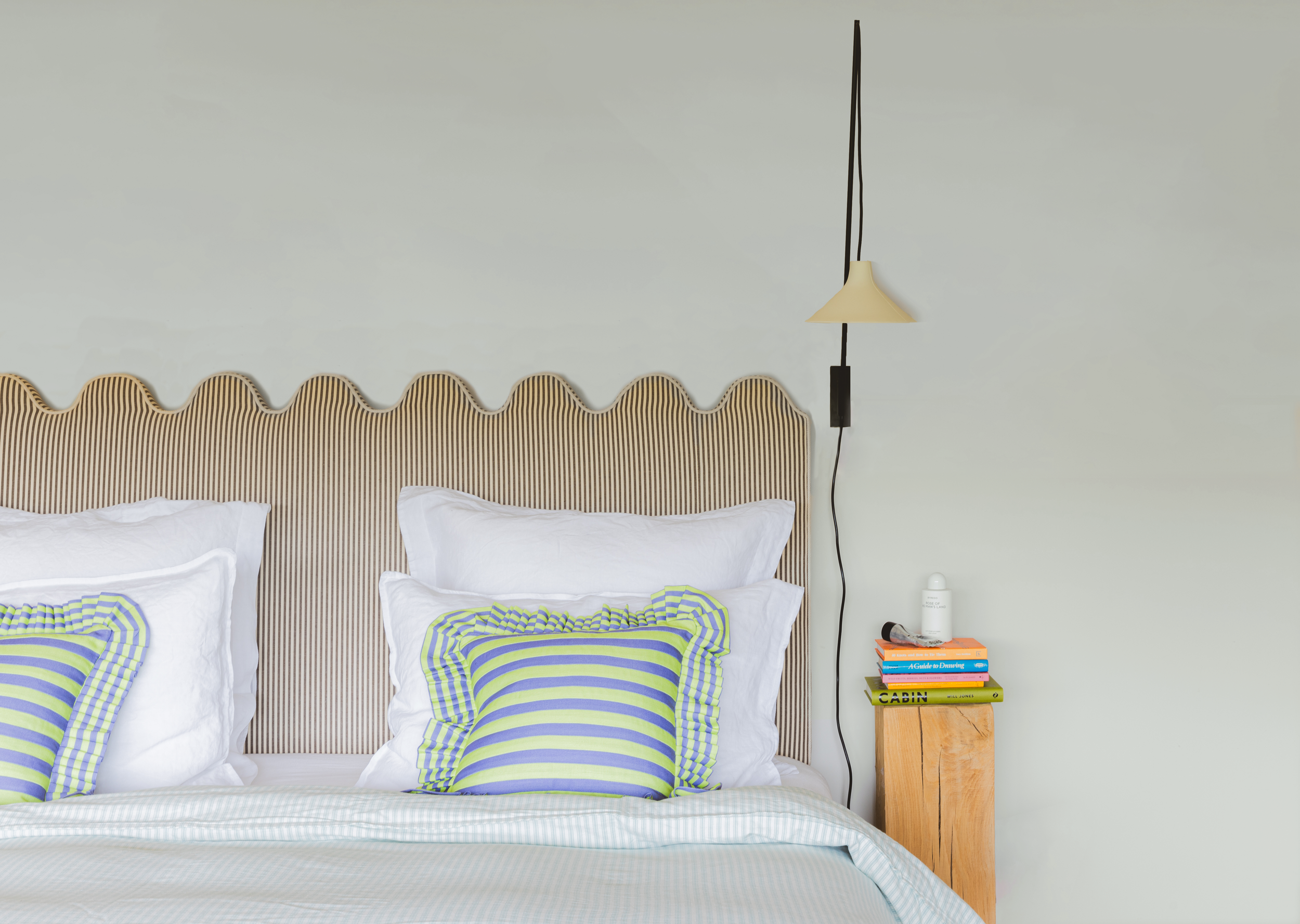
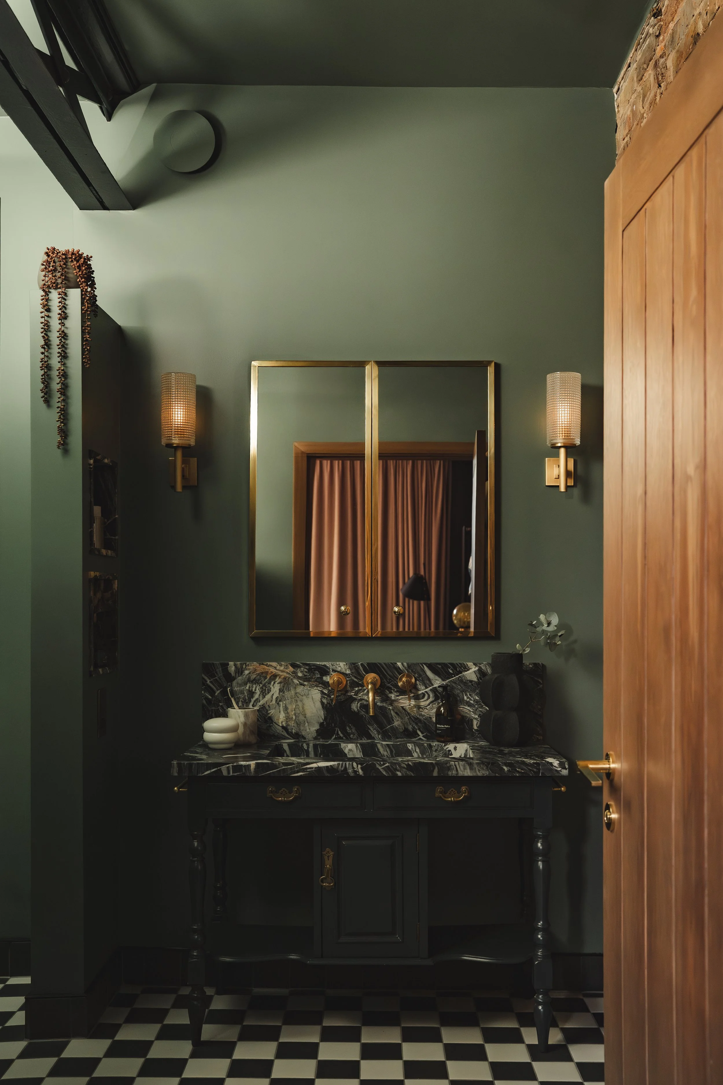
What we’re seeing right now is a mix of both confidence and comfort in how people approach colour. On the one hand, there’s more willingness to experiment and move beyond the very safe neutrals that have dominated for years. On the other hand, people are still drawn to colours that create warmth and calmness at home such as shades Sunday Soul or Mindful.
That really reflects how our relationship with our homes has changed. People are spending more time thinking about how their spaces feel, not just how they look. Colour is increasingly being used to create mood and atmosphere rather than simply acting as a backdrop.
So, the defining trend isn’t one specific shade but that people are becoming much more intentional about colour and how it shapes the experience of living in a space.

Warm whites, chalky pinks, and earthy browns — the neutral palette has evolved dramatically. What makes a “modern neutral” today, and how can homeowners avoid their space feeling flat or overly safe?
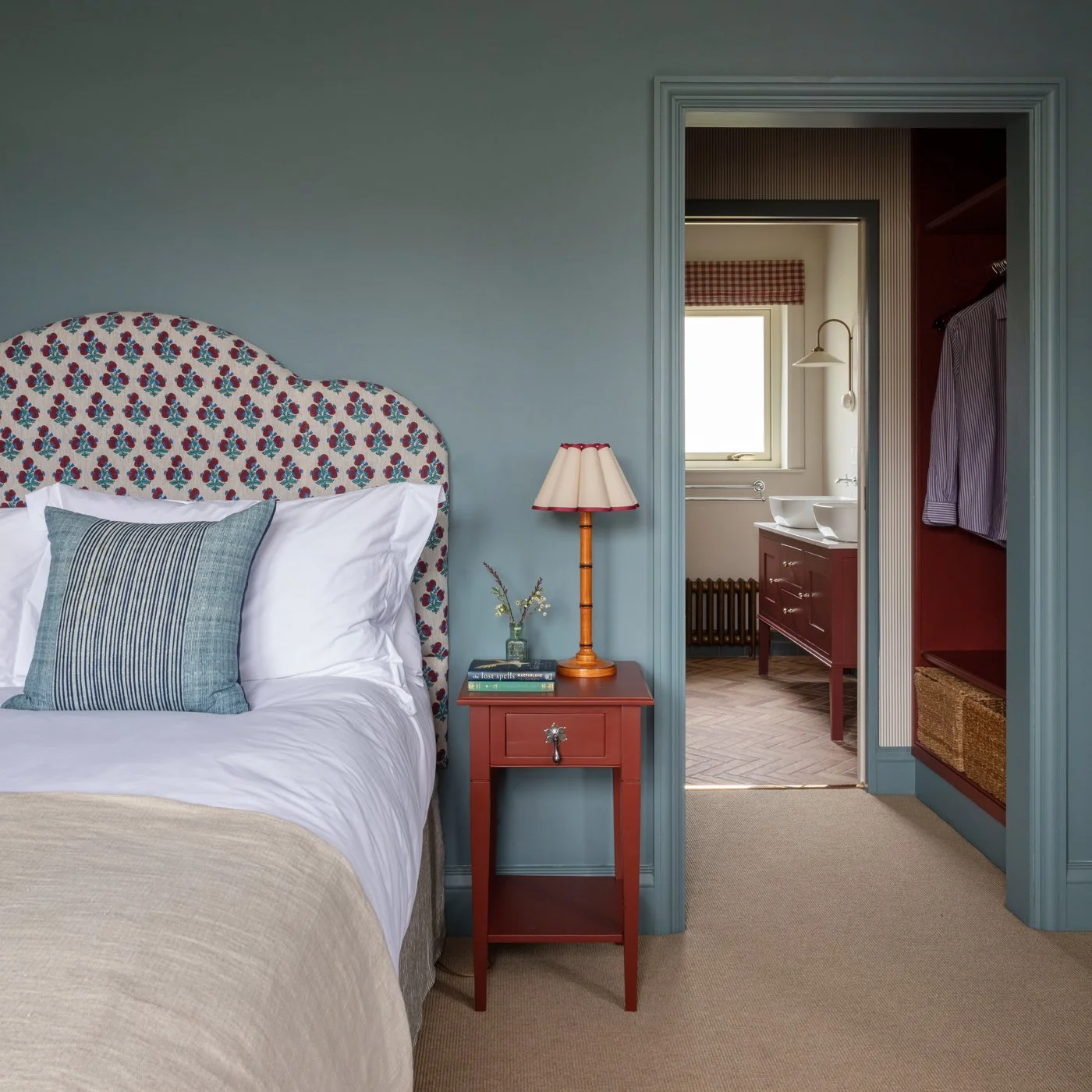
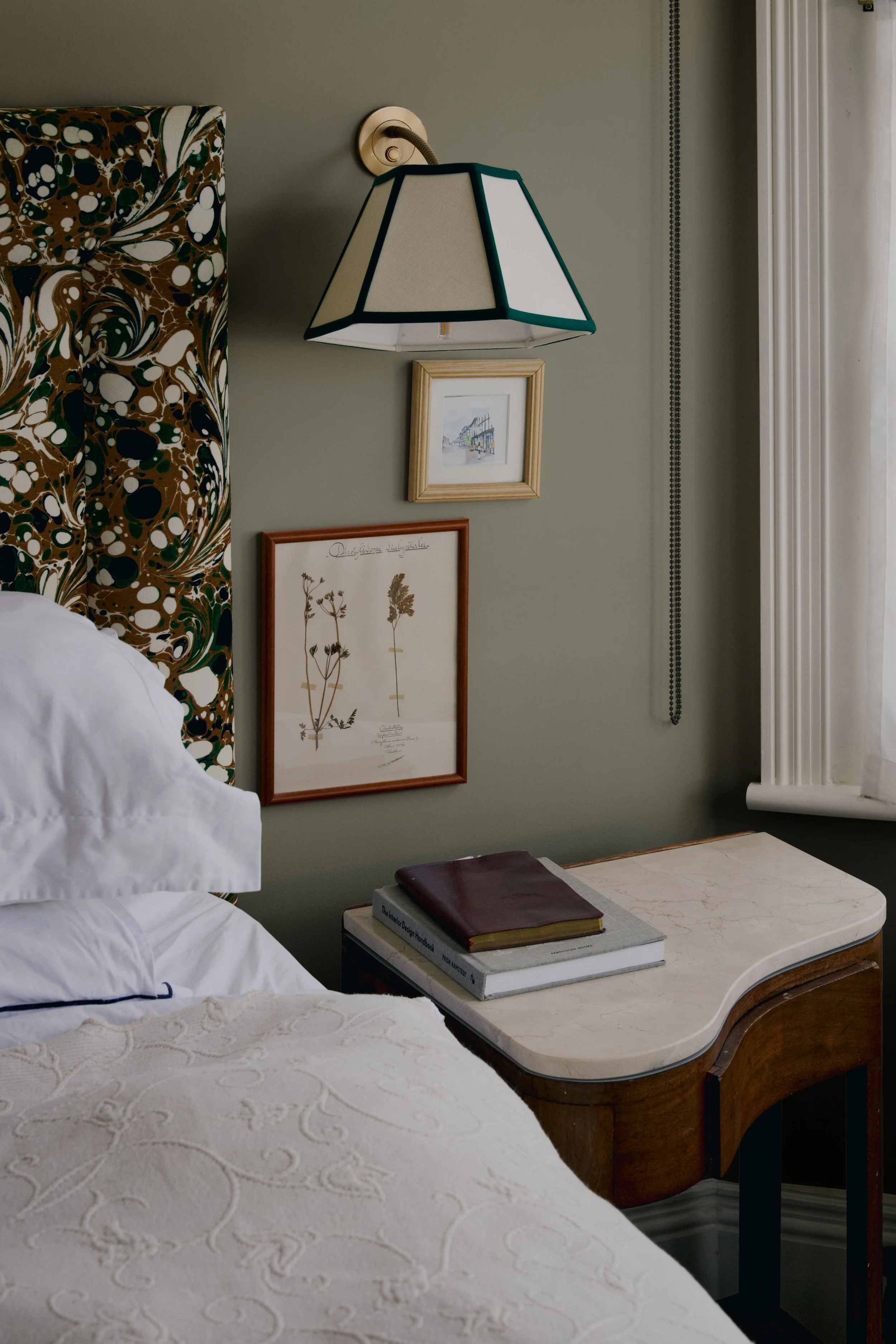
A modern neutral is really about depth and warmth. Instead of the very flat whites and magnolias people used to default to, today’s neutrals tend to have subtle undertones that give a room character without overwhelming it, shades like Good Intentions or Modest work well for this.
The key to making a neutral space feel interesting is layering. When you use tones that work together across walls, woodwork and adjoining rooms, you create dimension and flow throughout the home.
So rather than thinking of neutral as a single colour choice, it’s about building a palette. That’s what stops a space feeling flat or overly safe and instead makes it feel thoughtful and contemporary.
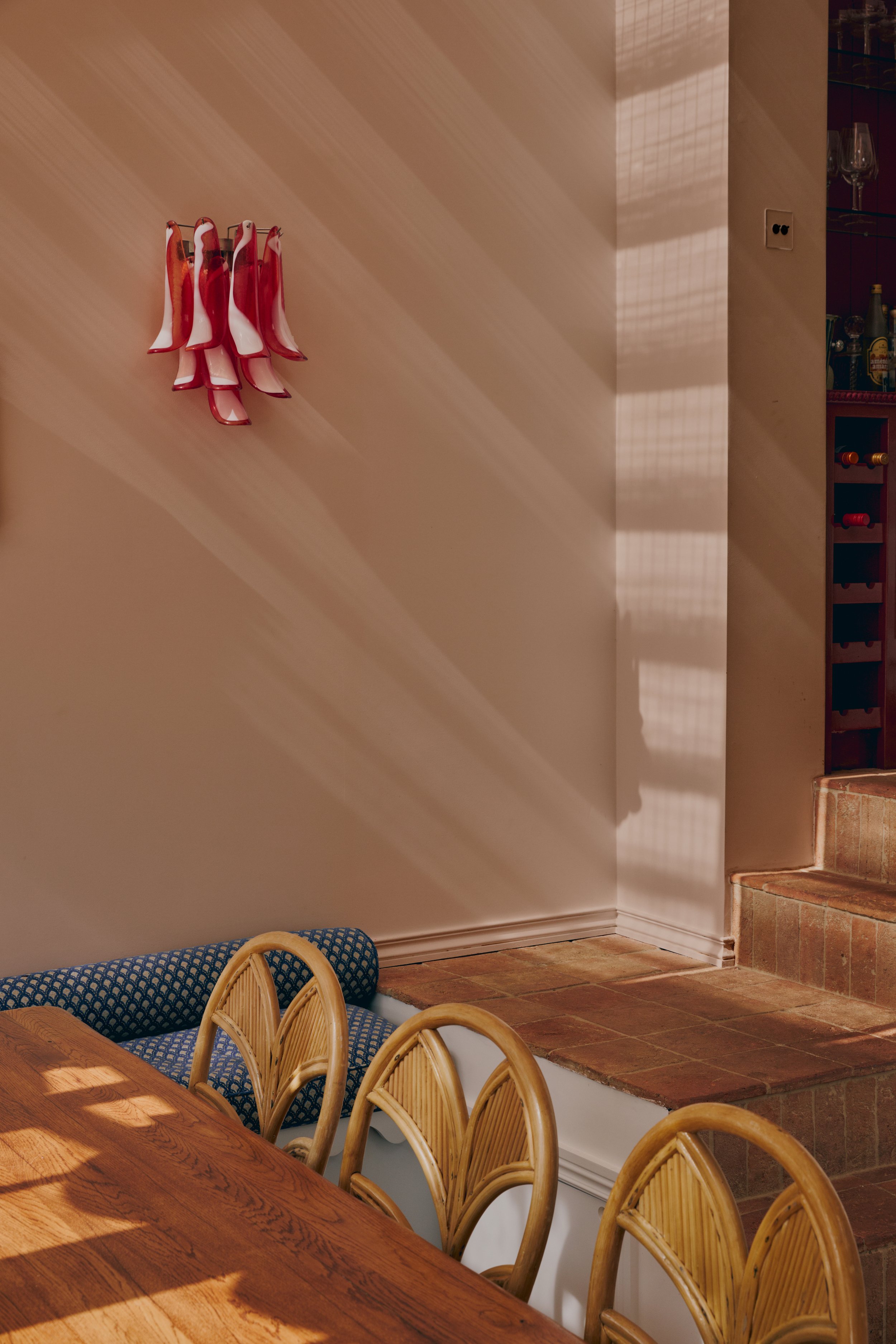
Some of the most exciting colour palettes are happening in restaurants and bars. Are there particular types of venues where bold or unexpected paint choices really come into their own? What combinations are working beautifully right now?
Hospitality spaces are often where you see the most confidence with colour because those venues are designed very deliberately to create a particular atmosphere.
For example, intimate cocktail bars often lean into deeper, moodier palettes that make the space feel immersive, while cafés and restaurants might use layered colours to create warmth and character. In those settings richer tones, strong contrasts or tonal palettes can work beautifully because they help define the experience of the space.
What’s interesting is that people increasingly take inspiration from those environments. A restaurant or bar might be the place someone first encounters a bold colour combination, and then they bring that same idea into their home. We are about the launch a collection with a recognised British seaside property, more on this to come!
Many people feel nervous about using strong colour in compact London flats or rental properties. What’s your advice for introducing personality through paint without overwhelming a space?
The biggest barrier is often simply confidence. When people are faced with thousands of shades, it’s easy to feel overwhelmed and revert to something very safe.
One of the ways we tackle that at COAT is by curating the palette so customers know the colours will work well together. That makes experimenting feel much less risky.
In smaller spaces, it’s usually about introducing colour in a thoughtful way rather than covering every wall. A richer tone on a single wall, pairing stronger colours with softer neutrals, or thinking about how colour flows between rooms can add a lot of personality without making the space feel heavy. Paint is one of the simplest ways to change the mood of a room, so it should feel empowering rather than intimidating.
Consumers are increasingly aware of what goes into their homes. How important has sustainability been to COAT’s growth story, and how do you balance eco-credentials with performance and durability?
Sustainability has been fundamental to COAT because when we looked at the industry we saw a huge amount of unnecessary waste. We built the brand around a more responsible model. Our paints are water-based and low-toxin, and we produce them to order so we’re not manufacturing huge quantities that might never be used. We’ve also introduced a recycling scheme where customers can return tins or leftover paint so it can be reprocessed.
At the same time, eco credentials only work if the product performs brilliantly. People expect paint to be durable, easy to apply and long-lasting, so our focus has always been on delivering sustainability alongside high performance rather than treating them as trade-offs.
Platforms like Instagram and Pinterest have made colour more shareable than ever. How has social media changed the way people choose paint, and do you see certain shades going viral in the same way fashion trends do?
Social media has completely changed how people discover and choose colour because it allows them to see shades in real homes rather than just on a sample card.
Platforms like Instagram and Pinterest have essentially become huge sources of interior inspiration. People save ideas, see how colours work in different spaces and then use that as a starting point for their own homes.
Because of that visibility, colours can gain momentum in the same way fashion trends do. A particular palette or shade can suddenly appear everywhere because people see it somewhere inspiring and want to recreate that same look or feeling in their own space.
Do businesses approach colour differently from homeowners? For example, would you advise a neighbourhood wine bar to be braver than a family living room, or are we becoming more adventurous at home?
Businesses often approach colour with a very specific objective. A wine bar, café or restaurant is trying to create a strong atmosphere or identity, so they can sometimes be more experimental with deeper colours or more dramatic palettes.
That said, homeowners are becoming more adventurous as well. With so much design inspiration available online, people are much more aware of how colour can transform a space.
So while a hospitality venue might still push things further in some cases, we’re absolutely seeing homes become more expressive. People are increasingly using paint as a creative tool to add personality and mood rather than just as a neutral backdrop.
Looking ahead, do you see us moving toward deeper, more immersive palettes — full-room colour drenching, lacquered finishes, tonal layering — or will we return to restraint? And where does COAT fit into that next chapter?
I think we’ll continue to see people becoming more confident with colour, which naturally opens the door to more immersive approaches. Things like tonal layering or using deeper shades across a whole room are already becoming more common as people think more holistically about how colour shapes a space.
At the same time, there will always be a place for restraint, particularly in rooms where people want a calm or neutral environment. It’s less about one extreme replacing the other and more about people feeling confident choosing what suits their home and lifestyle.
For COAT, our role in that next chapter is helping make those choices easier. By curating colours that work beautifully together and simplifying the process of choosing paint, we help people move beyond default safe options and feel confident creating spaces with real personality.
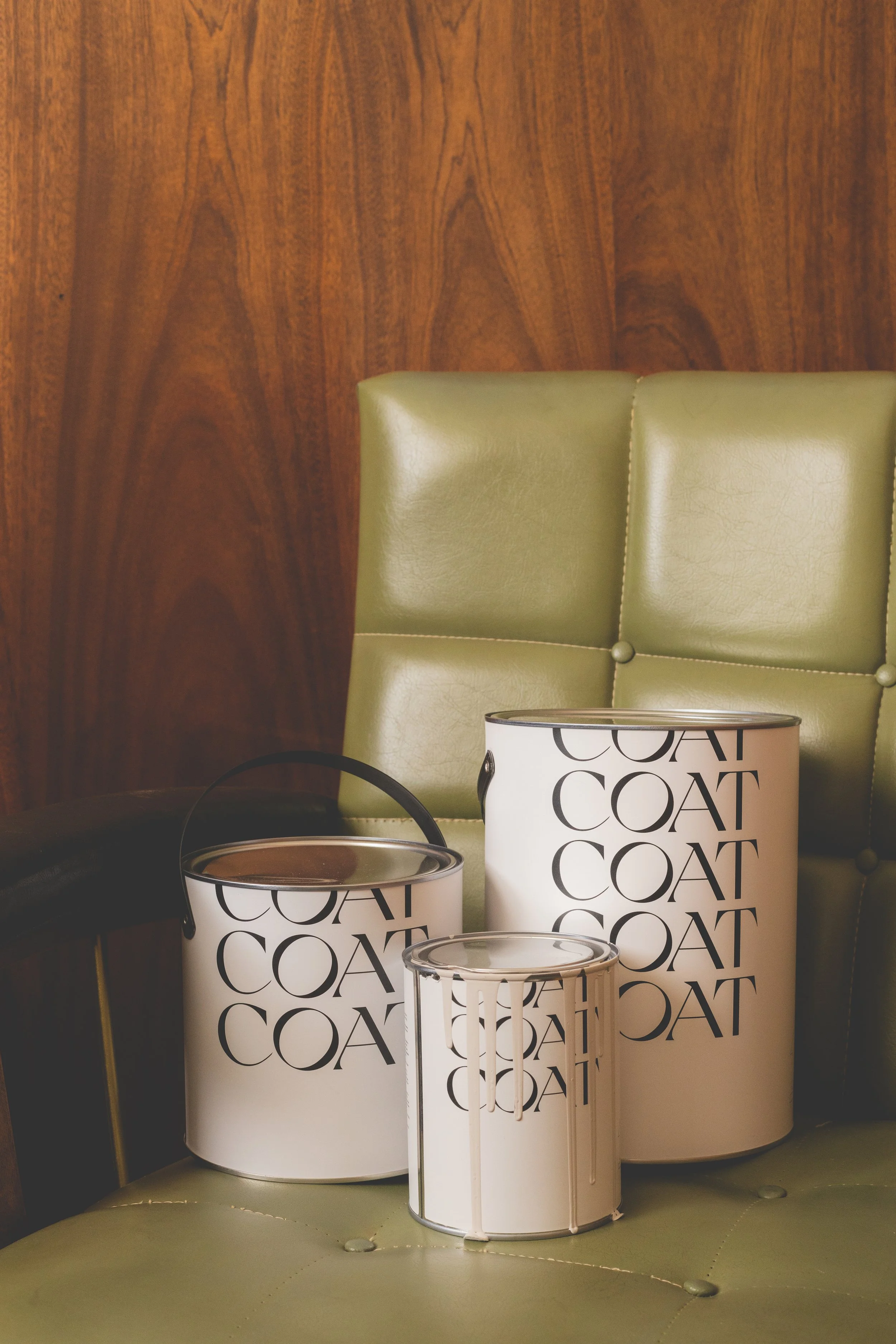
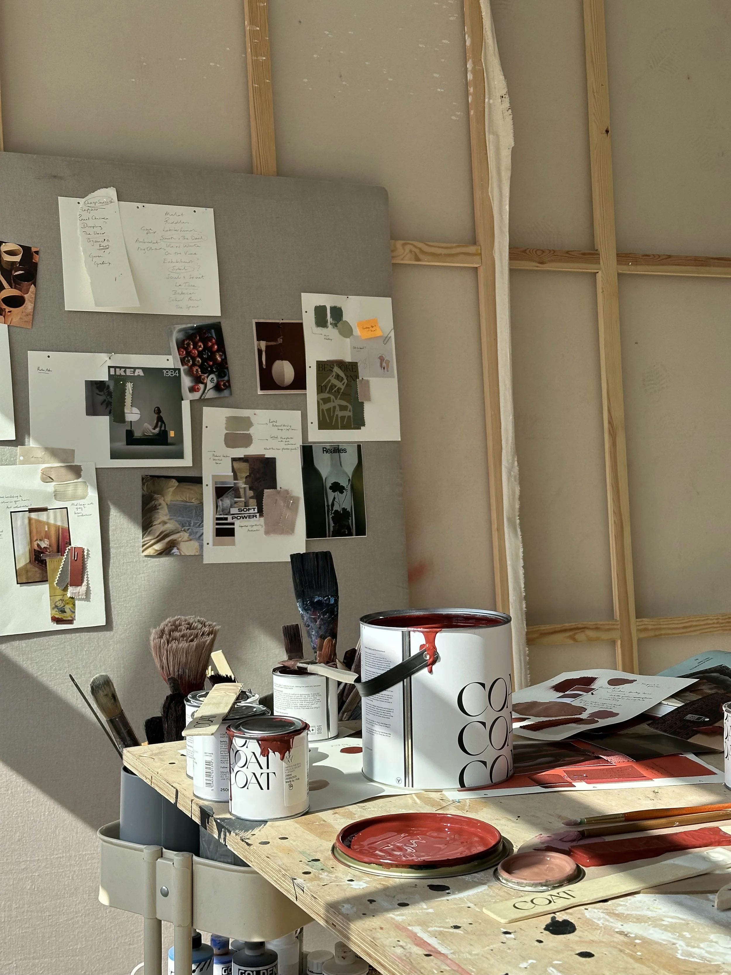
Photography, COAT.
More Interviews